


Khushi Bhut
"We need better UI" and "we need better UX" are two very different requests, even though they get used interchangeably in almost every client kickoff call we sit in on.
UI is what you see
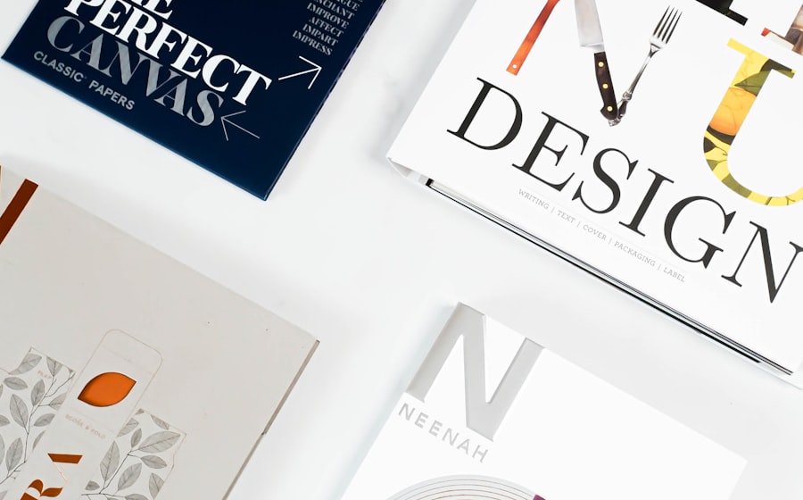
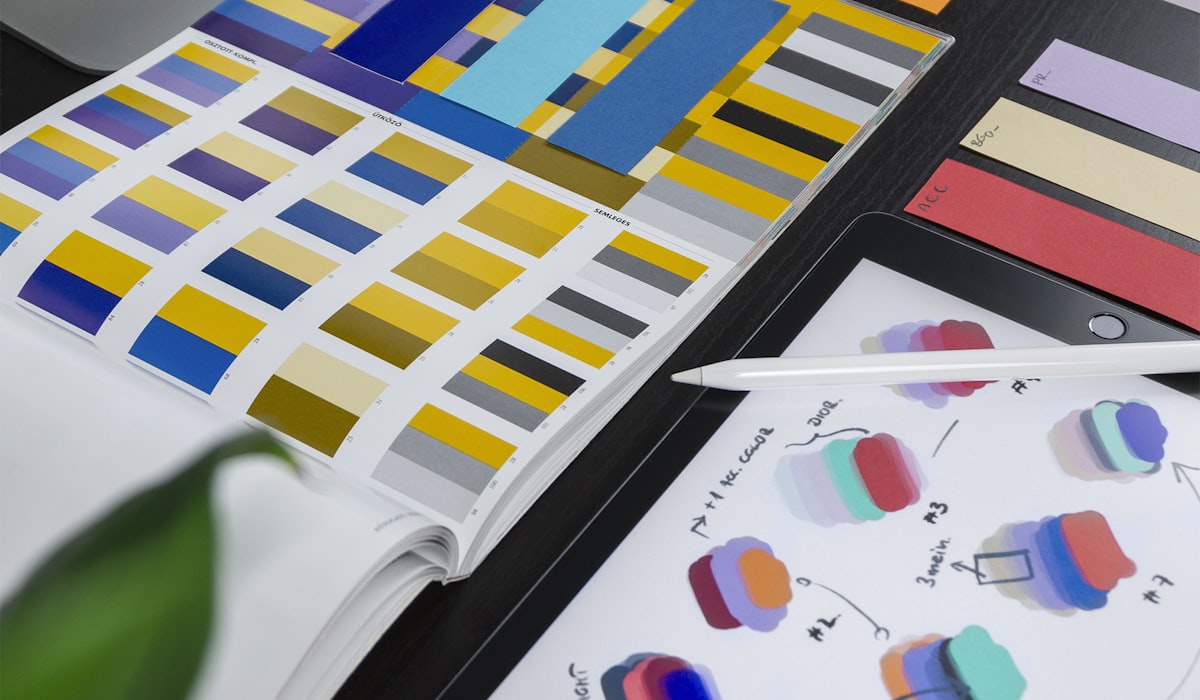
User interface design covers the visual layer — color, typography, spacing, iconography, and the visual hierarchy that tells someone where to look first. It's the part that shows up in a screenshot and gets shared on social media when a redesign launches.
UX is what you feel
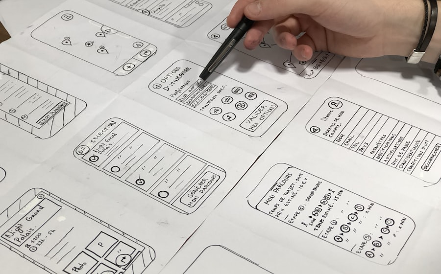
User experience design covers the entire journey — how easy it is to complete a task, how predictable the navigation feels, and how the product handles the moments things go wrong, like a failed payment or a form that resets itself. It rarely photographs well, which is exactly why it gets underinvested compared to UI.
We once redesigned a client's app with a genuinely beautiful new interface, gradients and all, and support tickets barely moved. The actual complaint — a checkout flow that silently lost people's cart data on a slow connection — was a UX problem hiding underneath a UI project. Fixing that, not the color palette, is what finally moved the needle.
How to tell which one you actually have a problem with
A quick diagnostic we use: if users can describe what's wrong ('the buttons are ugly,' 'I can't find the color I want'), it's often a UI symptom. If they can't quite articulate it but keep dropping off at the same step, contacting support at the same point, or abandoning the same flow, that's almost always UX. People are surprisingly bad at naming experience problems and surprisingly good at naming visual ones, which is part of why UI gets more attention than it deserves relative to UX.
- Rising support tickets at one specific step in a flow — usually UX, not UI.
- Users saying the product 'looks outdated' but completing tasks fine — usually UI.
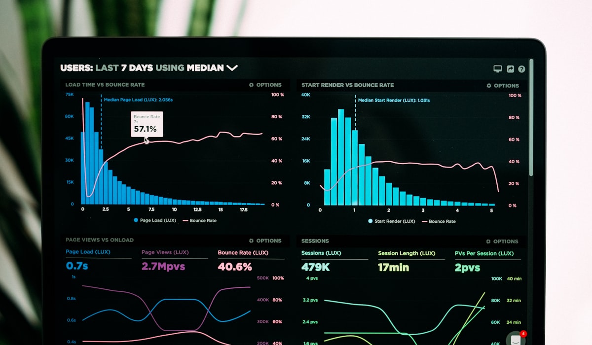
- High bounce rate on a page that looks polished — often a UX or content clarity issue underneath the UI.
- Low task completion despite positive comments on visual design — a strong sign the two have been decoupled.
Why they have to be designed together
A beautiful interface built on a confusing flow will still frustrate users. A flawless flow wrapped in a dated interface will still lose their trust before they even get to experience it. We've seen both failure modes up close: a technically excellent UX with an interface so dated it never earned enough trust to get tried in the first place, and a gorgeous interface sitting on top of a flow so confusing that the visual polish just made the frustration feel more expensive.
The products that actually work treat both as inseparable, because in practice, they are. Good UX gives people a reason to stay. Good UI gives people a reason to trust it enough to start. Neither one substitutes for the other, and a design review that only asks 'does this look good' is asking half the question.
Running a joint UI/UX review
We've moved away from separate design critiques for visual and experience work, because reviewing them apart tends to reinforce the false split in the first place. A joint review walks through the same flow twice: once asking whether each screen looks trustworthy and on-brand, and once asking whether a first-time user could complete the task without confusion, ideally with someone unfamiliar with the product actually attempting it live. Problems that show up in only one of those two passes are usually smaller than they look. Problems that show up in both passes are the ones worth fixing before anything else.
Training a team to notice the difference
Most design and product teams don't lack the skill to distinguish UI from UX problems — they lack the habit of pausing to ask which one they're actually looking at before proposing a fix. We've started running a simple exercise in design reviews: for every reported issue, someone has to state out loud whether it's a visual problem, a flow problem, or both, before anyone is allowed to propose a solution. It slows the meeting down by a few minutes and has caught more than one case where the team was about to redesign a screen's visuals to fix what was actually a broken flow underneath it.
Why this distinction matters more as teams scale
In a small team, the UI/UX distinction matters less in practice because the same one or two people are usually thinking about both simultaneously without needing to name the split. As a team grows and specializes — dedicated visual designers, dedicated UX researchers, separate front-end and product teams — the distinction becomes load-bearing, because it determines who owns which kind of problem and who gets pulled into which kind of review. Getting the terminology right early tends to prevent a lot of confused handoffs later, once the team is too large for everyone to just intuitively understand what everyone else is working on.
A quick self-check for any reported issue
When a stakeholder reports 'the app feels off' without more specificity, we've found it useful to walk through three questions before assuming it's a design problem at all: does the issue reproduce consistently, does it happen at a specific step in a flow, and does it correlate with a recent visual change or a recent flow change. The answers usually point clearly toward UI, UX, or occasionally an unrelated technical bug being mistaken for either. Skipping this diagnostic step is how teams end up redesigning a screen that was never actually the problem.
Ultimately, the healthiest sign a team has internalized the distinction isn't that they always agree on which category a problem falls into — reasonable people disagree on edge cases constantly. It's that the question gets asked consistently before a fix gets proposed, rather than skipped in the rush to ship something that looks like progress.
That discipline pays off most visibly during hiring and onboarding, when a shared vocabulary for these two categories of problem lets a new designer or product manager start contributing to focused, well-scoped conversations within their first few weeks rather than spending months absorbing an implicit, undocumented team convention through osmosis.