



Hepil Talaviya
Before a visitor reads a single word on your site, your visual identity has already made an impression — professional or amateur, trustworthy or forgettable — and that first read happens in a fraction of a second, long before conscious thought catches up.
Consistency builds recognition
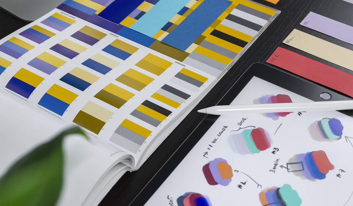
Color palettes, typography, and imagery style should stay consistent across the website, social channels, and any printed material. Recognition compounds. The more consistently a brand shows up looking like itself, the faster people remember it, and the less they have to think to recognize who they're looking at.
We rebranded a client whose visual identity had drifted across five years of different freelancers — a logo here, a color tweak there — and the most noticeable result wasn't the new look itself. It was how much faster their own sales team started recognizing brand materials in the wild, at trade shows and in client inboxes.
Design decisions carry meaning
Rounded shapes and soft colors read as approachable. Sharp edges and high contrast read as bold and confident. Every design choice, even the ones users won't consciously notice, quietly shapes how a brand gets perceived — whether anyone on the team intended it or not.
Building a system, not just a logo
A logo alone isn't a brand identity — it's one asset within one. The businesses that get the most mileage out of their branding treat it as a full system: a primary and secondary color palette with defined use cases, a type scale that works from a headline down to fine print, and clear rules for how the logo behaves on a busy photo background versus a plain one. Without that system, every new designer who touches the brand ends up making slightly different judgment calls, and the drift we described above starts again from year one.
- Primary and secondary color palettes, each with a defined role rather than 'use whichever looks good.'
- A type scale covering headline, body, and caption sizes, not just one font choice.
- Logo usage rules — minimum size, clear space, acceptable backgrounds, what never to do to it.
- An imagery style guide so photography and illustration feel like the same brand across every channel.
- A one-page brand brief that any new designer or freelancer can follow without a lengthy onboarding call.
Where brands lose consistency without noticing
The drift rarely happens in one dramatic decision. It happens gradually — a social media manager picks a slightly different shade of the brand color because the exact hex code wasn't written down anywhere, a new hire designs a slide deck using whatever default font their software shipped with, a sales team member builds their own one-off flyer for a trade show under deadline pressure. None of these choices are wrong in isolation. Compounded over a few years without a documented system to check against, they add up to a brand that looks like five different companies depending on which document you're looking at.
A strong brand identity isn't just about looking good. It's a shortcut to trust that shortens the distance between someone's first impression and their first purchase, which is ultimately what all of this is for. The businesses that invest in the underlying system, not just a one-time logo redesign, are the ones where that shortcut still works five years later.
Measuring whether a rebrand actually worked
Rebrand projects are notoriously hard to measure because the obvious metric — 'does it look better' — is subjective and doesn't tell you much about business impact. We track brand recall in a small pre- and post-launch survey where possible, and failing that, look at more indirect signals: whether sales conversations mention recognizing the brand from somewhere else, whether social mentions increase in tone or volume, whether internal teams start using brand materials more confidently without needing approval for every asset. None of these are perfect, but together they say more than a purely aesthetic judgment call ever could.
Rolling out a rebrand without breaking recognition entirely
A full rebrand risks a period where existing customers no longer recognize the business at all, which can undo some of the trust the old identity had built up over years. We generally recommend a transition period — dual branding on key touchpoints, a clear announcement explaining the change — rather than an overnight switch, especially for businesses with an established customer base that relies on visual familiarity to know they're in the right place.
Keeping the design system usable, not just documented
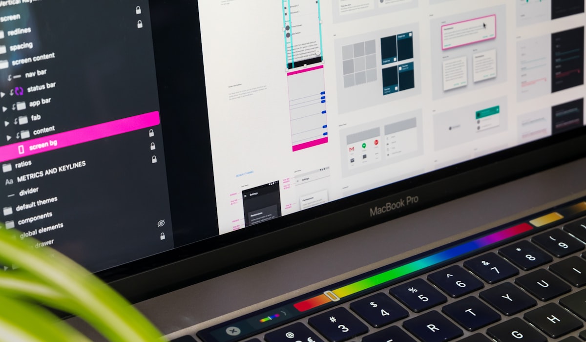
A brand guideline document that nobody actually opens might as well not exist, and we've seen beautifully produced brand books gather dust while the same inconsistency problems they were meant to prevent kept happening anyway. What's worked better is embedding the system directly into the tools the team already uses daily — a Figma component library, a shared color palette in the design software, pre-built templates for common asset types — so following the system is the path of least resistance, not an extra step someone has to remember to take.
Why cheap logo work rarely holds up
A logo built quickly and cheaply, without the underlying system described above, tends to reveal its limitations the first time it needs to work somewhere unexpected — a favicon, a social profile picture cropped to a circle, a single-color print application. We've inherited more than one brand identity that looked fine in its original presentation file and fell apart the moment it needed to adapt to a context nobody thought to test it against. Building the system alongside the mark, not after it, is what prevents that.
A brand identity is never really finished — it evolves as the business does, and the healthiest brands treat periodic refinement as normal maintenance rather than waiting for a full crisis-driven rebrand every several years once the drift has already become obvious to everyone outside the company.
We've found that businesses who treat their visual identity as an ongoing investment, revisited and refined every couple of years rather than locked in and forgotten, end up with brands that feel current without ever needing the disruptive, expensive full rebrand that a decade of neglect eventually forces.